Designing a killer SaaS landing page is as much an art as a science. Besides having to be aesthetically pleasing and balanced, it also must be informative and compelling enough to convert visitors into customers.
However, a landing page is not a set-and-forget kind of thing. It is an ongoing project. You must continuously optimize it based on performance and the feedback from testing.
So, let’s see what makes a good SaaS landing page and how you can create one.
The framework of a good landing page
Every good SaaS landing page has a few elements that must be addressed. However, in recent years, brands have shifted towards minimalism and forgotten the essentials. Many are looking at brands like Apple and think ‘That is a great way of marketing your business! It is simple and elegant and people love it!”
Even though that is true, many start-ups or scale-ups forget they don’t have the same brand recognition as Apple. So, people are just confused when they visit their landing pages.
In their process of creating a minimalist and ‘clean’ landing page, these companies are leaving out at least one of the four layers of a landing page:
- Clarity – what is your product/service and who is it for?
- Relevance – is it aligned with your visitor’s pains and priorities?
- Value – does it guide your visitors to realize they need this?
- Differentiation – why should they pick you?
Building blocks of a compelling landing page
Besides the way you phrase your message, you also need to pay close attention to the sections of your page.
Hero Section: Captivating Headline & Value Proposition
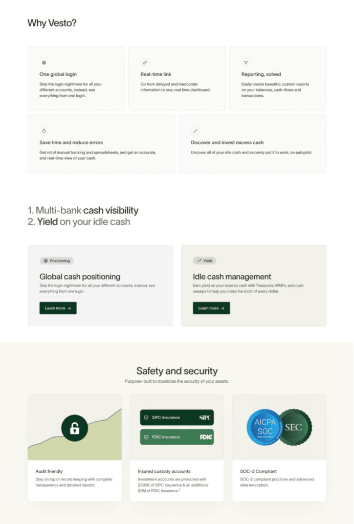
This is where the customer builds the first impression about your company. So you will need to skip all the fluff and go straight to the point. What is your product? Let’s take the example of Vesto’s home page.
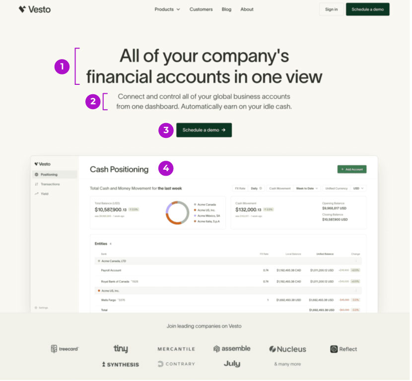
- Title – this immediately answers the question ‘What does your product do?’. It is clear and doesn’t leave the user wondering about it.
- Supporting text – this short paragraph is there to support the main idea and briefly explain how the product works or what problem it solves.
- CTA – Some website visitors might be ready to try your product straight away These can be the solution or problem-aware users covered in the SaaS content strategy article. So it is important to have a call to action ready for them in your hero section.
- Tool preview – even though you are putting a lot of effort and resources into creating your landing page, don’t think that visitors will read everything on it. They might just skim it and move on to the next website. So you need to include a screenshot of your tool to show them how the problem could be solved and provide more context.
Social Proof & Trust Signals: Building Credibility with Testimonials & Logos
The purpose of this section is to build trust and authority. In here, don’t just mention ‘Trusted by X thousand companies’. Include the logos of your biggest and most recognizable clients. Make it as visual as possible and don’t expect the visitors to read.
Also, you can sprinkle social proof sections throughout your landing page. You don’t have to condense everything in one spot. For example, you can mention your biggest clients right below your hero section and include some testimonials after your value proposition section.
Value Proposition: Addressing Pain Points & Benefits
This section is where you double down on and expand the ideas you briefly mentioned in the hero section. It is where you address all the objections and questions about the value of your tool that the page visitor might have.
However, focus on the benefits users will experience, not just technical features.
How it Works: Explaining the core functionalities
In case your product or service falls into a fairly new product category or if you want to showcase how is your product different from other solutions out there, you can include a ‘How it works’ section.
Here, you can explain some of the features and capabilities of your product to make sure the page visitor has all the information they need.
SaaS landing page mistakes
With the current state of marketing, companies are sacrificing efficacy and clarity in their messaging for vague phrases and buzzwords. And the irony is that they are trying to stand out, but because everyone is doing the exact same things, they just blend in and confuse their page visitors.
Let’s have a look at some examples of fluffy messaging and see how unclear the landing pages are.
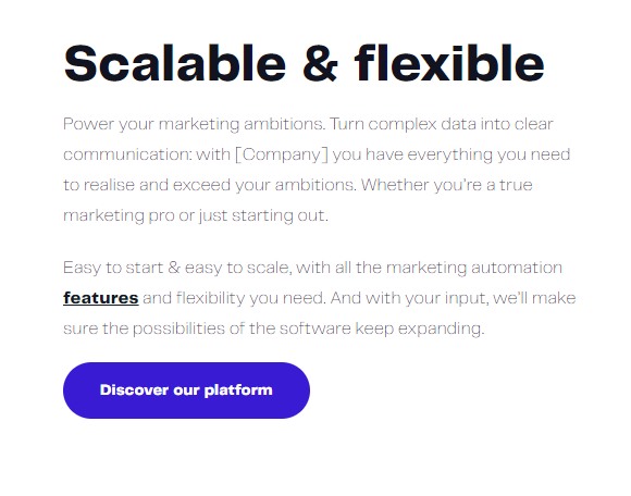
Poor Hero Section
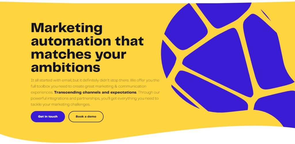
Right off the bat, the title doesn’t tell me what the software does. I only know that they fall in the ‘marketing automation’ category.
Only in the supporting text do they mention email marketing. And promising me more than that – ‘but it definitely didn’t stop there’.
They mention they offer a full toolbox for creating great marketing and communication experiences without saying what exactly the product is or does.
Unclear value propositions
Scrolling down on the same landing page, we have the value propositions section. Here, I thought they would provide more clarity over the service or product they provide, but instead, they used the same cryptic messaging.
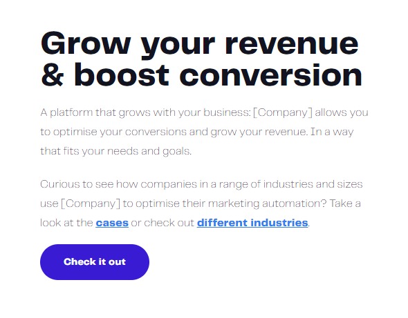
They put a lot of emphasis on the customer’s ambition, marketing automation, and business expansion, but they don’t say how exactly they help with that. This whole section is still confusing and doesn’t provide the information the potential customer is looking for.
Weak social proof
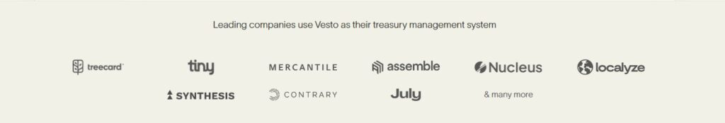
If we return to Vesto’s homepage example, we can see that even though it is a good and clear page, it has one obvious weakness – the testimonial section.
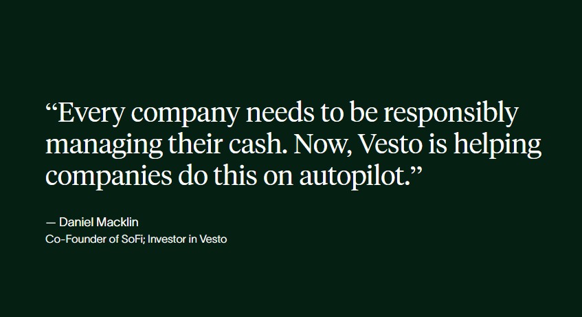
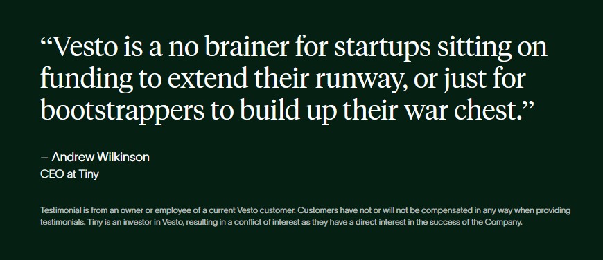
They have included testimonials from their investors. As they have a clear interest in the company’s well-being, they will not be as convincing. These testimonials will be seen by potential customers as a conflict of interest and they will be discredited immediately.
Instead, they could use testimonials from regular clients who give their honest opinion about the product they offer. These will be perceived as genuine and will contribute more to the decision process.
Final thoughts
A lot of SaaS landing pages are poorly designed, so the bar is pretty low. You don’t have to do an extraordinary job to create a good landing page.
You just have to make sure you are addressing the right audience, talking about their pain points, and how your service or product is bridging the gap.
Don’t try to go for flashy or buzzwordy content. If you keep it simple and focus on the clarity of your message, you might see better results.
Another important thing to keep in mind is that you don’t have to stick with only one landing page. You can create as many as you want. If you offer a product with 10 features don’t try to cram everything into one page.
Consider designing separate landing pages for each of the features. Even if they might not get as much organic traffic, you can use them in your advertising efforts. This will also allow you to tailor the message of your ads to match the individual landing pages.
And, as always, you need to test everything. The content, the CTAs, the images, the order of the blocks, etc. A/B tests are your friend. This is extremely important as a landing page is a living thing. It is not meant to be set and forgotten.