When it comes to ecommerce conversion rates, there’s a big difference between product pages and landing pages. But the problem is not everyone knows the distinction between them.
And this is why most ecommerce business owners are sending their traffic to their product pages. And this makes sense, right? Well…yes and no.
It does make sense because it is the most logical thing to do. But at the same time, it doesn’t because according to Monetate you can increase your conversion rates with dedicated landing pages
Product pages vs landing pages
Product pages are the pages where people can find and buy your products. These are the default pages created within the ecommerce platform you are using.
Landing pages are dedicated pages which are built with a very clear purpose: convert people into customers.
Simply put, a landing page explains all the benefits and tries to answer all the questions of a potential customer. And it includes links to the product detail page which will have the product variant selector, a short description, some other details, and the ‘Add to cart’ button.
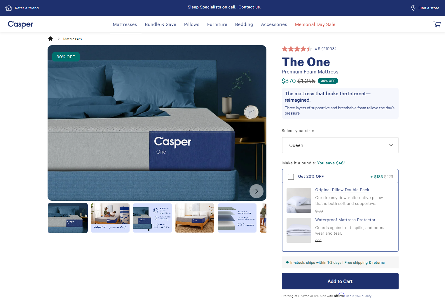
To see that in action, we can look at Casper. Here’s what the landing page looks like.

And this is the product page people land on after clicking on one of the CTAs.

The ecommerce landing page x-ray
There are a lot of elements going into a successful landing page. But that doesn’t mean it is complicated to build one. The process is actually pretty simple.
The tricky part is to take all of these elements and optimize them. They need to work together and form a cohesive landing page that convinces the user that your product is exactly what they’re looking for.
Understanding Your Landing Page Goals
An ecommerce landing page has clear, straightforward goals. And if you want to build a good one, you will need to identify key elements about your customers and your products.
- Identifying your target audience: Who are you trying to reach or help with your product? You must understand their demographics, needs, and online behavior to craft targeted messaging. This will help you to find out what could drive them to purchase your product.
- Defining your conversion goal: Usually, the primary goal for ecommerce businesses is a direct sale. But depending on your marketing strategy and the tactics you use, this goal can also be an email sign-up or app download. A clear goal will determine the Call to Action (CTA) and overall structure of the page.
- A/B testing strategy: Plan to test different variations of your landing page elements to see what resonates best with your audience. The first version of your landing page should always be just the starting point. After it is live, you need to collect data, analyze it, and develop hypotheses on how you can improve it.
Crafting Compelling Content
Once you know what your customers want and what is your goal for the landing page, you will need to put that into words. Crafting good copywriting is crucial for increasing the conversion rate. You can apply the same techniques from search ads copywriting, but you have the advantage of having fewer limitations.
- Headline that grabs attention: First impressions matter. And the headlines are amongst the first things the users see. Use strong verbs, benefits-oriented language, and keep it concise to pique visitor interest within seconds.
- Benefit-driven product description: You need to keep in mind hat your customers have a problem. You are selling the solution. Focus on how your product solves customer problems and improves their lives. Highlight key features but prioritize the benefits they provide. Think of the classic example of the iPod. It wasn’t presented as having 5Gb of storage. It was presented as having 1000 songs in your pocket.
- Clear and scannable copy: Write concise, easy-to-understand content using bullet points and bolded text for emphasis. How you write and present your ideas is as important as the ideas themselves. People will not read all the text on the page, so be deliberate with your copy.
Visual Appeal and User Experience
Now that we have covered all the information we want to present in text form, it’s time to move on to the visuals. Your landing page needs to look attractive and keep people engaged with every scroll.
- High-quality product images and/or videos: Showcase your product from multiple angles. Get up close and personal. Show your audience how the product is used, and insert lifestyle elements to enhance its appeal.
- Mobile-friendly design: Don’t focus only on desktop devices. You will advertise this page, and your ads will not reach only desktop users. Ensure your landing page is optimized for all devices, with responsive layouts and easy navigation on smaller screens.
- Limited distractions: Once you get the user’s attention, you need to make sure you keep it for as long as possible. This will increase your chances of getting the sale. Minimize navigation elements and keep the focus on the product and the CTA.
Building Trust and Credibility
With the content of the page in place, it is time to look at how to prove your trustworthiness. User see a lot of nicely looking websites, but that doesn’t mean they automatically trust and buy from them.
- Social proof and testimonials: Showcase positive customer reviews, ratings, or quotes to build trust and social validation for your product. 92% of customers read at least one review before making a purchase decision.
- Security badges and trust signals: Include logos of secure payment gateways and any relevant certifications to demonstrate a secure buying experience. This will also offer the customers information on the payment methods available on your website.
- Scarcity and urgency: Consider limited-time offers or limited quantities to create a sense of urgency and encourage immediate action. However, be careful with how you offer discounts. You don’t want to decrease the perceived value of your products.
The Power of a Strong Call to Action
The main purpose of an ecommerce landing page is to convert. But you need to guide your users to buy. So, make sure you have well-placed and well-crafted CTAs on the page.
- Clear and action-oriented CTA button: Use strong verbs like “Buy Now” or “Add to Cart” with a contrasting color to make it stand out.
- Multiple CTAs throughout the page: Reinforce your desired action with CTAs at different points on the landing page, not just at the bottom.
- A/B test different CTA variations: Experiment with button text, color, and placement to see what drives the most conversions. You can test having only CTA at the bottom of the page, having the same button in multiple places, or having different CTAs scattered across the page.
Ecommerce landing page example
Let’s take a look at an ecommerce landing page and see how it was built and what are the strong points and what they could test to improve the page.
Here is the full landing page of Emotiva’s X-Series product line for audiophile music and home theater components.

Let’s start breaking down their landing page and see the good and bad parts and what would be a great place to start testing.
They know exactly who their audience is: audiophiles with high demands, extensive technical knowledge, and willing to spend large amounts of money to achieve an insane level of audio quality.
But I think the headline doesn’t fully reflect that. It is a bit fuzzy, and they can A/B test different angles to see what would work best.
The description below, however, is better. We all know that audiophile equipment is expensive, but they are doing a great job of saying their products are affordable without devaluing their brand.

With the extra information below the hero image, they are building trust. They suggest they have worked on improving the original line of products. This suggests that they are looking to increase the value of their products continuously.

They continue highlighting the benefits and some features; I don’t hate that. Because this is a specific audience with extensive technical knowledge. So they could respond well to features. However, this assumption could be A/B tested.
The overall page looks good, it’s clean, with great visuals, and a very good layout.
But I do miss some elements which could make the page better. The only social proof they have is the ratings and number of reviews in the product range section.
I would include some more reviews and even user-uploaded images to build more trust.
Also, the company offers monthly payments through Affirm. But they only have a small banner at the bottom of the page right above the footer. Because they are selling high-ticket items, they should test making this more prominent and include it higher up the page. Besides this, they should also include the other forms of payment they accept.

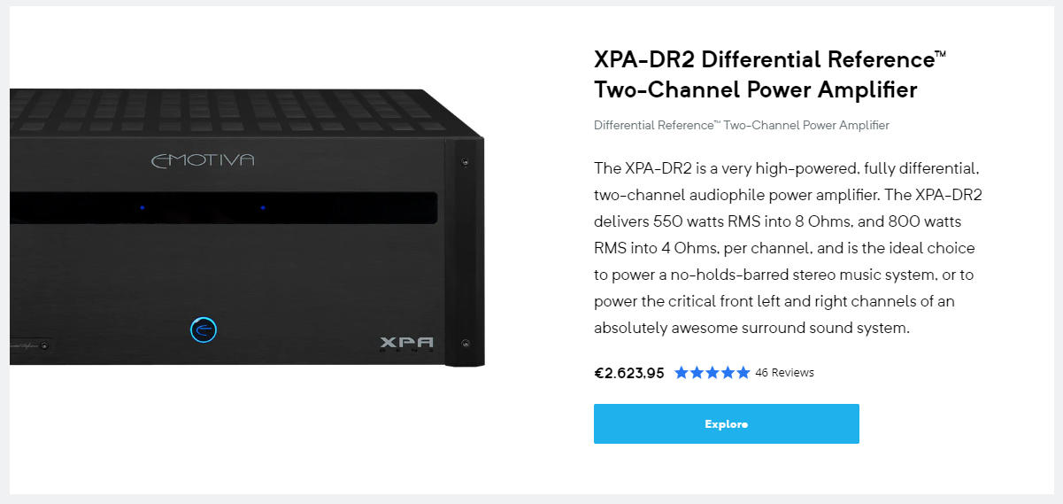
For the product cards, they can test the CTA. Given that the ‘Explore’ button lands the customer on the product page, maybe they can test different words, such as ‘order today’, ‘buy now’, or check price’.


